Welcome to my blog, enjoy!

Friday, June 17, 2011

Graphic Design Final: Art --> Design

For our final project, we were asked to take a piece of art, and turn it into graphic design.  I started with a picture of a man cliff diving. 


I then started to turn this photo into graphic design by adding text to the picture, then added a shadow, inner light, and bevel and emboss to the text.  "Live life to its fullest, Take risks" 


Next i added a light effect to the entire photo to  create shadows.  I also added a lens flare to give it an extra effect. 


Lastly, i added floral brushes just to give an artistic element to the graphic design poster.  This last picture is my final result.  I am extremely happy with the  result.  To create this poster, I didn't use any tutorials, just one google image and the rest was all learned skills from throughout the year.

Wednesday, June 15, 2011

Scale Composite

For this project, we had to take a picture of a friend and then place them into a scene of an unusual sort.  This was our scale composite assignment.  I photographed my friend Gabby and then edited the photos, and found a picture of a stack of books online.  I then placed 2 pictures of Gabby onto the stack of books.  I wanted to keep it simple so i left the white background.

Event


In this assignment, we were to tell a story through 3 pictures, and three pictures only.  Since my cousins wedding was coming up I  chose to take photographs, and tell the story of her wedding ceremony.  Below is my final outcome.  It starts with her father giving her away to her groom, then the exchange of the vows, followed with a kiss.  I edited each picture to make the main focus the bride and or groom in each photo.

PANORAMA

These are three Panoramas that I took from the outside of my school.  I took 4 pictures for each setting and then combined them following a tutorial from online.  This task was very simple, and I'm happy with my outcomes. Below are my 3 Panoramas.


Alphabet!

This project is made up of 26 different text effects and tutorials.  I personally didnt find this project too difficult, although it mostly depended on the tutorial.  I am proud with the final outcome, and I learned quite a bit about filters and effects on Photoshop.

Thursday, May 5, 2011

Fantasy Design Project


So, after reworking some of the tutorials i used, and sketching something out i achieved the above poster.  I love the background the most, and thought the stamps for the planets were beyond awesome.  Making the lightning was so simple and easy, and i worked out my issue with the land on the floating island.  The only struggles i ran into were on the tutorials, and by the time i started my final i believe i worked them all out!

Fantasy Design Poster- Tutorials

So for this project, i started by trying out a bunch of different tutorials.  Below are all the ones that i had tried, and i used three of the four i attempted, combining them into my final poster which will come in my next post.  I'm pretty happy with the way all my tutorials came out!  I only had difficulties with the floating island because i couldnt figure out the grass, but in my final project i edited it and figured it all out.


Below are the JPG's of the results of each tutorial to the extent that I followed it.  (Yeah i know, the floating mountain is kinda a fail... but it looks way better in my final!)

Friday, April 15, 2011

Point of View Shoot


Below, and the the left, are my point of view photo's.  Each picture was to be taken at an angle other than head-on.  So for the orange picture, i placed my camera onto the counter to take the photo, and the chair photo i was on the ground to get to the level of the chair. For the photo of the flower pots, i had gotten as close as i could to the first one in the photo so i couls get this kind of effect.  The pictures outside of the contact sheet are the photo's i think are the best, and personally the on to the left is my favorite.  


Some photo's (contact sheet) are in black and white because i felt they had a greater effect that way than in color.

Thursday, April 14, 2011

3 Things That Don't Belong...

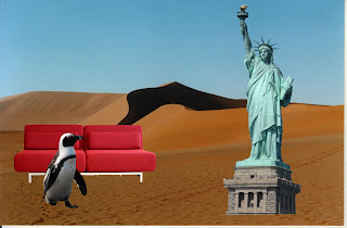
For this Project, we focused on using the layer mask tool.  I used the desert as my background, and then pulled my other photos onto it.  The i started to use the layer mask tool to remove the backgrounds from the penguin, sofa, and statue of liberty.  This project was not very difficult for me, mostly because i had a background in doing this from Graphics class.

Design Principles Research

Tuesday, April 12, 2011

Social Awareness Poster


So This is my social awareness poster, Support Local Musicians.  To make this i had used a tutorial from this site.  Before this turtorial i had tried many others before it, but none of them really fit the tone of the message i wanted to send out.  I had sketched something as if it we're a poster posted on a concert venue hallway.  I was extremely pleased with the outcome of this poster  My final of following the tutorial is below (left), and i then recreated it from scratch to create my final, above.  To follow the tutorial above, i used the following images (right-planks, and top left- band image).  I took the photo of the wooden planks and lightened them to look more natural and bright.  Then i started to create my poster... There was a lot of shading involved to make the poster look worn and torn, and to my surprise it was not very difficult at all.  I did follow the tutorial, but added my own touches with the text, and i took out some of the shading because i personally didnt like it very much.  The band in the poster is All Time Low.


Tuesday, March 15, 2011

This is my color theory video, i hope you enjoy.


SOURCES- http://kuler.adobe.com/; google images; http://www.colormatters.com/colortheory.html; http://www.logo-design-india.com/blog/color-or-symbol-which-is-more-important-in-logo-designing/

Monday, February 14, 2011

My Own Logos


This is  my first logo, my full name.  This one is really  simple and that is kind of what i was going for.  The other logos that i made for my full name were either to complex, or just not my favorite.   This one out of around 40 seems to stick out the most to me.  I just merged the letters, and placed them where I wanted to create this logo.

This next logo is my initials.  I drew the petals using the brush took, and the center is the circle tool.  Once again I merged the fonts, and then put them in the center of the flower.  This one was the first logo i made when starting this project, and has been my favorite throughout.


Lastly, this logo is symbol replacement.  I seem to go with the more simpler logos that I make. With this one, I simply replaced the the o's with hearts that I drew using the brush tool.  This one is very simple, once again, and stuck out the most as my favorite.

Friday, January 28, 2011

Photoshop

Another photoshop tutorial.  In this one i used the magnetic lasso tool, patch tool, and many other tools the cut something and then place it somewhere different.  This started with one globe, the 5 had a shadow, the flower had a white background, the lock was in a picture, and the pen had a gray background.  After using the tools specified in the tutorial, i managed to separate each from their backgrounds to accomplish this final collage!

Another Photoshop Tutorial

So, in photo, we were assigned another tutorial.  This one was to practice hiding layers and the benefits of doing so.  After following each step... this was the result (right).  After completing that, using the same document, we were told to put three people into the picture.  To do so i simply copied all the layers, and hid the originals.  Then i took three members (Ryland Blakington, Alex Suarez, Gabe Saporta) from the band Cobra Starship, and added them to the photo.  This is all on the same photoshop file, just different layers!

Wednesday, January 26, 2011

Practice Macro

Before I did my actual shoot, (previous post) we had a practice macro shoot with shells, to the right is my contact sheet.  I didn't edit any final photos.

Macro Shoot

For photo, we were assigned a macro shoot.  I chose to photograph a fencing mask, along with a sneaker.  I took the pictures, uploaded them to Adobe Bridge, created a contact sheet on Adobe Photoshop, and finally edited the three photo's i thought were best.  Above is my contact sheet, and below are my photo's i chose to edit.


Black and White

So, after following this simple tutorial, and by using only a few simple tools and techniques i learned how to add color to black and white photo's using adobe photoshop.  The picture stated like this (top left), and after i completed all the steps, it ended like that (bottom left).  Blue is my favorite color, and although very subtle i really like this picture.

Monday, January 3, 2011

Macro Photography

My class was assigned to find our definition of Macro Photography through research.  Well after reading some things and analyzing a few photos (below) i have come up with what i think is Macro Photography.

  • Macro Photography-basically, this is the art of taking close-up photos.  For it to be considered macro photography the photo is in focus, zoomed up entirely getting extreme detail. (Source)
  • Below the post, i have different examples of Macro Photography posted.
  • Tools- To take such photos, a specific lens is, sometimes, necessary.
    • I researched tools that photographers used, and i came across this site, Edberg Photo.  I learned that there are many different lenses, as well as other types of tools that you can use to get such detailed photos.
      • A few tools that i will list are the- Macro lens, close-up filters, reversing lens, and stacking lenses.
    • At the bottom of this site, the one posted, there is a great example of how each of the tools work.  It amazed me at the difference between them all and how well they actually work
  • When asked what i would photograph, when doing a macro photography assignment, i immediately thought of a flower, fake or real.  
    • 3 subjects i'd want to photograph:
      • Flower
      • My bass guitar
      • A lock
    • Each of these subjects would create unique photos, and if i were assigned this i would photograph each. (except  i wouldn't bring my bass to school!  If it was in-class i would photograph a textbook instead.)