Welcome to my blog, enjoy!

Friday, November 12, 2010

Logo's Again

So i was google-ing logos, again! and i came across some more really cool ones.  and i also learned about some new tools to use in illustrator.  So below are more logos that i gotta go thorough and decide which one to try :) 


  • Spiral
    • Ok, so this is the really awesome spiral writing that you always see and wonder HOW DID THEY DO THAT.... well at least i always do!  Now i know and its actually not that hard.  I will definitely be using this in some project no matter what.
  • DJ Logo
    • this one seems like fun, and i would definitely use it, it's too bad you have to pay for the template though. maybe i can find something similar and try that!
  • "Swirls and Flourishes"
    • It isn't technically a logo, but the design can be made into one, well in my opinion. It's  a really simple and more a classy logo.  I can imagine this one with the branches on the side, and in the center my name in a nice simple font.
  • Font
    • I want this font. like now.  This is so awesome. It says its  a logo for a rock band, and i do agree. this does fit a band.  Obviously a majority of the logo's i have posted have something to do with music or and a rock-esque to them :)  i love music and punk/rock designs.
  • "Paranoid"
    • This font reminds me of the font one of my favorite bands, Cobra Starship, uses as their signature font.  It's not exactly the same... they are actually kind of different but  it's the same vibe.  I guess that's why i like it a lot.  I dont really understand how its called 'paranoid ' though...
OK, so i think i have enough logo's and fonts to go through.  Once i sketch something up and actually create it, i'll post something on here!
Wednesday, November 10, 2010

Final Illustrator Tutorial

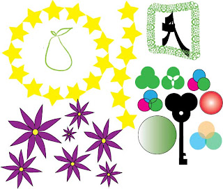
This tutorial anyway was a lot easier than the last one.  I actually knew what i was doing and didn't really have any problems.  I'm proud of this sketch sheet, and unlike my other one where the lines are very shaky and uhm.. well i guess for a beginner it was ok. but i liked this stage of the tutorial a lot better.  This one looks kinda way better. hahaha anyway hope you think the same.  remember its just practice.

  • TOOLS:
    • brush tool (mainly used)
    • circle shape
    • pen tool
    • pathfinder

  • Coloring-
    • Gradient
    • transparency
    • outline
  • My grade-
    • Out of 10 on this tutorial, i'd give myself a 9/10.
      •   The 9 is my grade for the look and execution of the tutorial.  This is the best i could do and it actually came out pretty well.  I don't want to sound like i'm bragging, but i think this came out pretty darn well for a beginner, plus the tool was pretty simple to understand.
      • The 10 is for participation,  I had plenty of time to work on this and i had actually worked ahead on this.  It's not due for a while, and i have already completed it.  I complete all my work on time in this class, which in the end is a good thing!


Monday, November 8, 2010

Logo Tutorials!

So i was researching some tutorials on how to make some awesome logo's... and here are my favorites-

  • 3-D
    • obviously this one shows you how to make a 3-D logo on illustrator.  Although it kinda seems simple, i thought it was really cool and i cant wait to use this in a project.
  • Go Green!
    • This one is cute. it does look kind of complicated, but it looks like a fun one to try.  And if i could complete it i'd feel pretttty accomplished..  If i were to use this logo in a project i feel like it'd best be used for an ad.
  • Ornate Lettering
    • Ok, this reminds me of something i'd see on an album cover for a band.  This seems really awesome, yet really complicated. i will probably download the tutorial and try to use this for my logo project.
  • Surfer
    • This one is nice because you dont necessarily have to use a picture like this.  The first step is picking your picture, and i'd love to do this maybe with a guitar or something of that nature.   This tutorial has def. been bookmarked.
  • Simple Banner
    • This tutorial finishes simple, but as i went through it... the steps (well to me) seem complicated. haha i would give this one a try, because a simple look is sometimes better depending on the project.

Rocket Ship!

  • My Thoughts-
    • So. after two days of using illustrator, we were told to create a rocket ship by following a tutorial (this one). My thoughts were... "well this will be a sad looking rocket ship" because i honestly had no idea how to do anything of this nature.  But in the end... it actually came out pretty good just by following each step on the tutorial. and it was kinda fun...  
    • The only problem that i had with this was the shadow and gradient.. i need some help to thoroughly understand what i'm doing with that.. haha
  • Tools Used-
    • Shape tools
      • Elipse, Star, Rectangle
    • Pen Tool
    • Gradient
  • My Grade-
    • 6/10
    • 6- This is for the actual finished project.  This rocket ship could use some help, but it was the best i could complete it.  The overlay or shadow is a little dark on it, but other that that it seems to be a nice rocket ship.
    • 10- Participation.  I have yet to complete a project late, and i had enough time to finish this project to the best of my abilities.  I try to complete my work in class, then do whatever else i can/want.


Illustrator Masterpieces...


  • My thoughts-
    • so for graphics we moved from Photoshop... to Illustrator.  (personal opinion- photoshop is way better/easier)  Anyway, it took me MANY tries to finally achieve the wonderful creations below :)  and the pen tool is... well, not fun. Below is a tutorial i followed, well sketch sheet, of what we practiced drawing using the pen tool.  and might i add, it was MUCH easier once i learned how to trace an image.  At least now i fully understand how to use the pen tool. 
  • TOOLS USED-
    • Star Tool (Shape)
    • Rectangle Tool (Shape)
    • Elipse Tool (Shape)
    • Pencil Tool
    • Pen Tool
  • My Grade- 6/10
    • I give the final product a 6 because the lines are... very shaky, and i had to trace them to even get to this point.  Honestly i almost used the pencil tool to try and pull it off as the pen, but in the end the tracing helped me... ALOT.  Although it looks kinda bad this was the best i could possibly do, i tried many times
    • 10- Participation is a 10 because i finished this project on time, although i had missed a class or 2 i still completed it to the best of my abilities.