Welcome to my blog, enjoy!

Friday, April 15, 2011

Point of View Shoot


Below, and the the left, are my point of view photo's.  Each picture was to be taken at an angle other than head-on.  So for the orange picture, i placed my camera onto the counter to take the photo, and the chair photo i was on the ground to get to the level of the chair. For the photo of the flower pots, i had gotten as close as i could to the first one in the photo so i couls get this kind of effect.  The pictures outside of the contact sheet are the photo's i think are the best, and personally the on to the left is my favorite.  


Some photo's (contact sheet) are in black and white because i felt they had a greater effect that way than in color.

Thursday, April 14, 2011

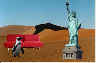
3 Things That Don't Belong...

For this Project, we focused on using the layer mask tool.  I used the desert as my background, and then pulled my other photos onto it.  The i started to use the layer mask tool to remove the backgrounds from the penguin, sofa, and statue of liberty.  This project was not very difficult for me, mostly because i had a background in doing this from Graphics class.

Design Principles Research

Tuesday, April 12, 2011

Social Awareness Poster


So This is my social awareness poster, Support Local Musicians.  To make this i had used a tutorial from this site.  Before this turtorial i had tried many others before it, but none of them really fit the tone of the message i wanted to send out.  I had sketched something as if it we're a poster posted on a concert venue hallway.  I was extremely pleased with the outcome of this poster  My final of following the tutorial is below (left), and i then recreated it from scratch to create my final, above.  To follow the tutorial above, i used the following images (right-planks, and top left- band image).  I took the photo of the wooden planks and lightened them to look more natural and bright.  Then i started to create my poster... There was a lot of shading involved to make the poster look worn and torn, and to my surprise it was not very difficult at all.  I did follow the tutorial, but added my own touches with the text, and i took out some of the shading because i personally didnt like it very much.  The band in the poster is All Time Low.